Logo Usage
This is the Jurupa Unified School District Logo
The elements – typography and symbol – are carefully designed and proportioned to work harmoniously as one unit. Its design was inspired by the eagle, a universal symbol of courage, wisdom, and strength. The eagle flies higher than any other bird and is a fitting symbol signifying the limitless potential of JUSD students.
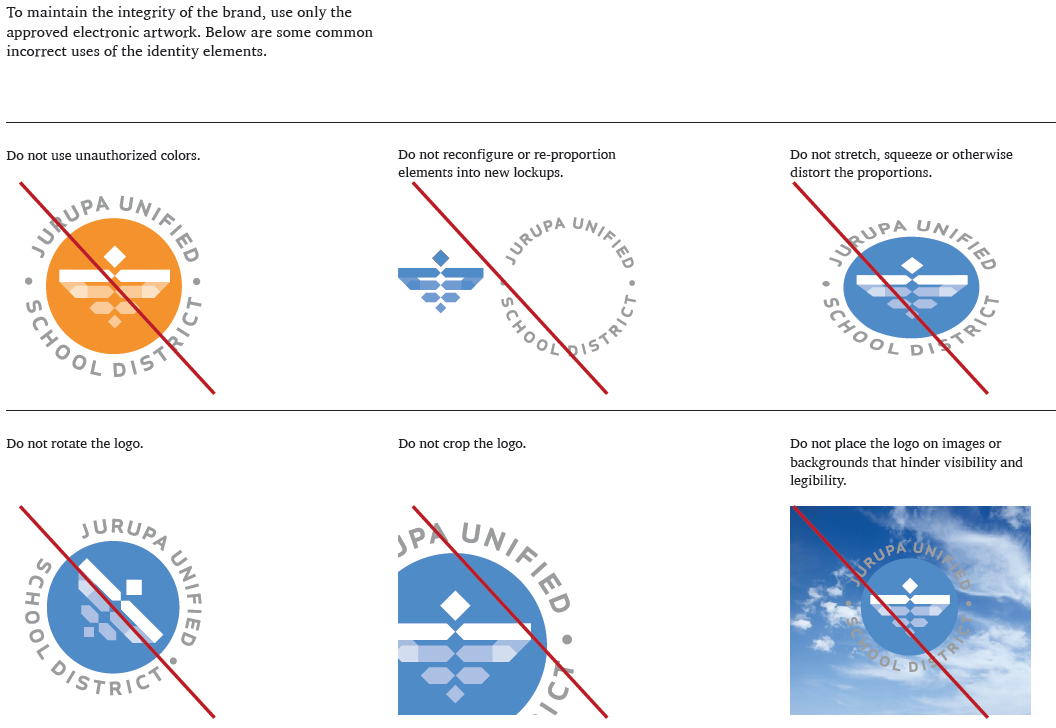
The logo may be manipulated only by increasing or decreasing its size. Altering the logo is not permitted. Please use the information on this page when using the Jurupa Unified School District Logo. If you have any questions, please contact the Communications & Leadership Development Department at (951) 416-1561.

These alternate logo versions were created for situations where using the primary logo in full color is not an option. The optimal background on which the logo is to be placed is white. The black version is reserved strictly for black and white or grayscale situations. The single white color type version works best on applications where heavier color and/or imagery is used throughout the layout or when minimal color is available.
Clear Space
The minimum allowable clear space helps properly stage the logo in relation to text, photos, graphic elements and page/screen edges. As a general rule, the more clear space the better. This clear space is determined by measuring the height of the eagle indicated below with an x at the size it is being used. This measurement establishes the minimum clearance on all four sides outside the circular JUSD type.
Minimum Size
The minimum allowable size of the logo helps prevent legibility and production issues. Typically, the size of the logotype — not the symbol — is the determining factor.